SIRVIS
How might we create a more user friendly experience when it comes to vehicle servicing?
OVERVIEW
My role
User Researcher
User Experience Designer
User Interface Designer
Project Information
Individual Design Sprint Exercise
Tools
Pen and Paper
Figma
Photoshop
Project Constraints
For this project, I'll limit my options to only one kind of vehicle and only one service centre.
My process
User Interviews
Persona
How Might We
Ideation
User Map
Lightning Demos
Crazy 8’s
Solution Sketch
Storyboarding
Prototype
User Testing
Timeline
5 Days
Challenge
I wanted to learn the design sprint to improve my UX skills, so I solve a problem that I have been facing for two years.
Problem
I always forget my bike scheduled service dates and end up getting my bike serviced after a month or two because of my tight schedule. Sometimes I forget to list issues that I need to get fixed at the service centre. Then I get to stick with those unfixed issues till my next scheduled service because I don't want to waste my another day at the service station. I only have my Sundays off, so I usually take my bike for service on the same day but the service stations are heavily packed on Sundays and then I end up waiting another 2-3 hours for my turn.
What I did
Before any design work, I interviewed bike owners about how they service their bike. Then I ran a one-week individual design sprint. During the sprint, I uncovered goals and opportunities, generated possible solutions, and tested those solutions with actual bike owners.
DAY 1
MONDAY
Map
User Interviews, Persona, How Might We, Ideation, User Map
User Interviews
I conducted a quick semi-structured interview with people around me. By performing interviews, I learnt existing user behavior, pain points towards the problem.
Can you tell me about the last time you get your bike serviced?
How often you get your bike serviced?
Could you describe step by step the whole process?
Which step is the most time-consuming?
Did you ever try or compare other alternatives to solve your problem?
Persona
After Analyzing the data collected from the interviews, I created a persona that represents my target users for the app.
“Personas help in narrowing down our user base and help in keeping our target audience that we want to serve in mind”
How Might We
I have identified problem areas that pose challenges to the people I'm designing for. Now, I'll reframe my insight statements as How Might We questions to turn those challenges into opportunities for design.
How might we ensure our users remember all the issues they have been facing for the last 3 months?
How might we ensure that our users don't forget the service date?
How might we ensure that our users don't waste a lot of time in the workshop waiting for their turn?
Ideation
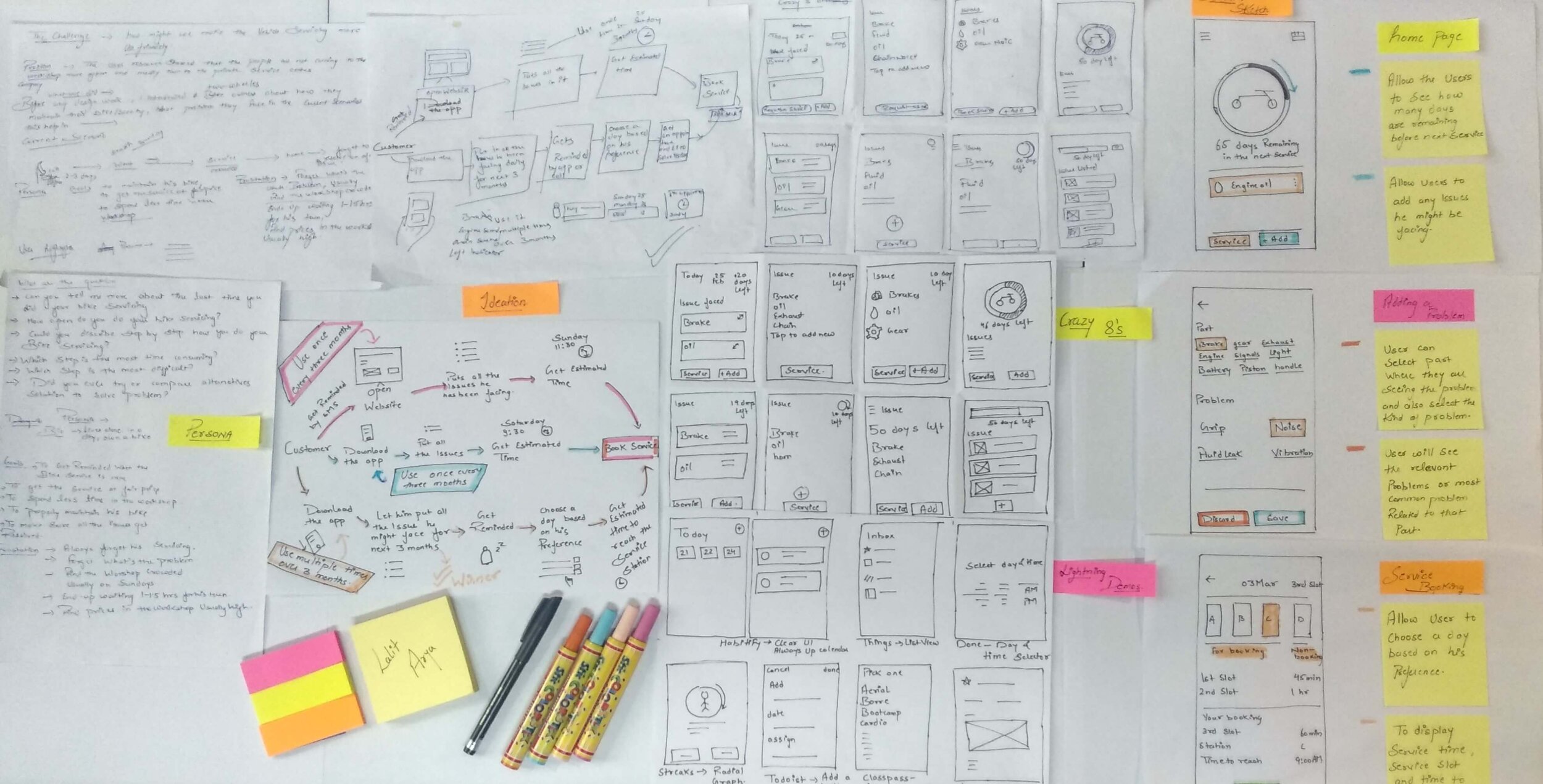
I sketched a few possible ideas to solve the problem and choose the most promising ones.
User Map
After sketching possible ideas and choosing the most promising one, I finished day 1 of my design sprint by coming up with a user scenario.
DAY 2
TUESDAY
Sketch
Lightning Demos, Crazy 8’s, Solution Sketch
Lightning Demos
I looked through other products in order to find what I can use in my product. This included all types of apps, not just limited to bike servicing.
Crazy 8’s
My most favourite exercise is crazy 8, wherein 8 minutes you need to come up with 8 variations for the best idea. Under conditions of forced stress, due to time constraints, the brain begins to work differently and unexpected interesting solutions arise from the subconscious.
Solution Sketch
I picked one screen from the “crazy 8's” exercise and sketch out a solution sketch for the app with additional comments on how it should work.
DAY 3
WEDNESDAY
Storyboard
Today I'll decide on what to prototype, and ultimately test. I have spent the previous days assembling a collage of features, ideas and sketches. Now I need to convert it into a storyboard for tomorrow.
DAY 4
THURSDAY
Prototype
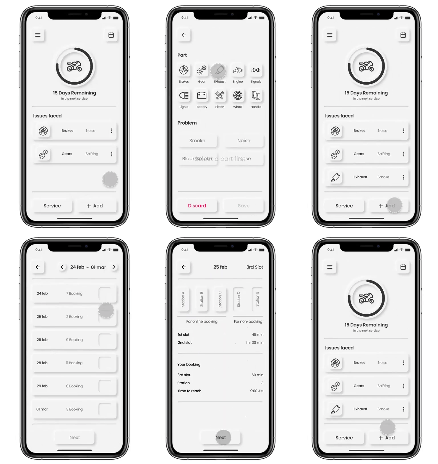
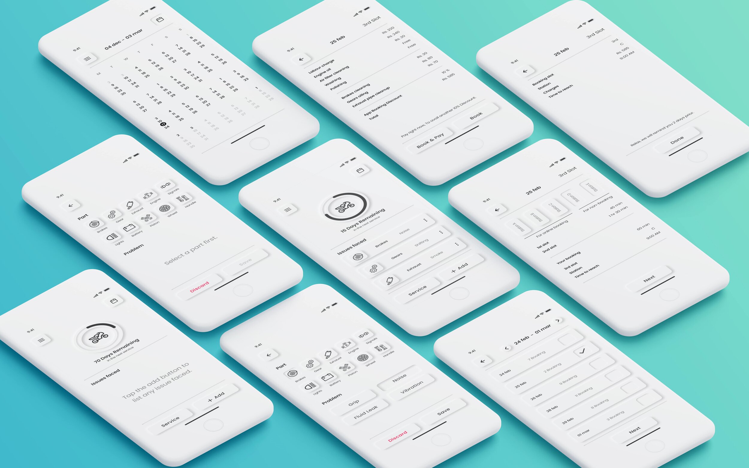
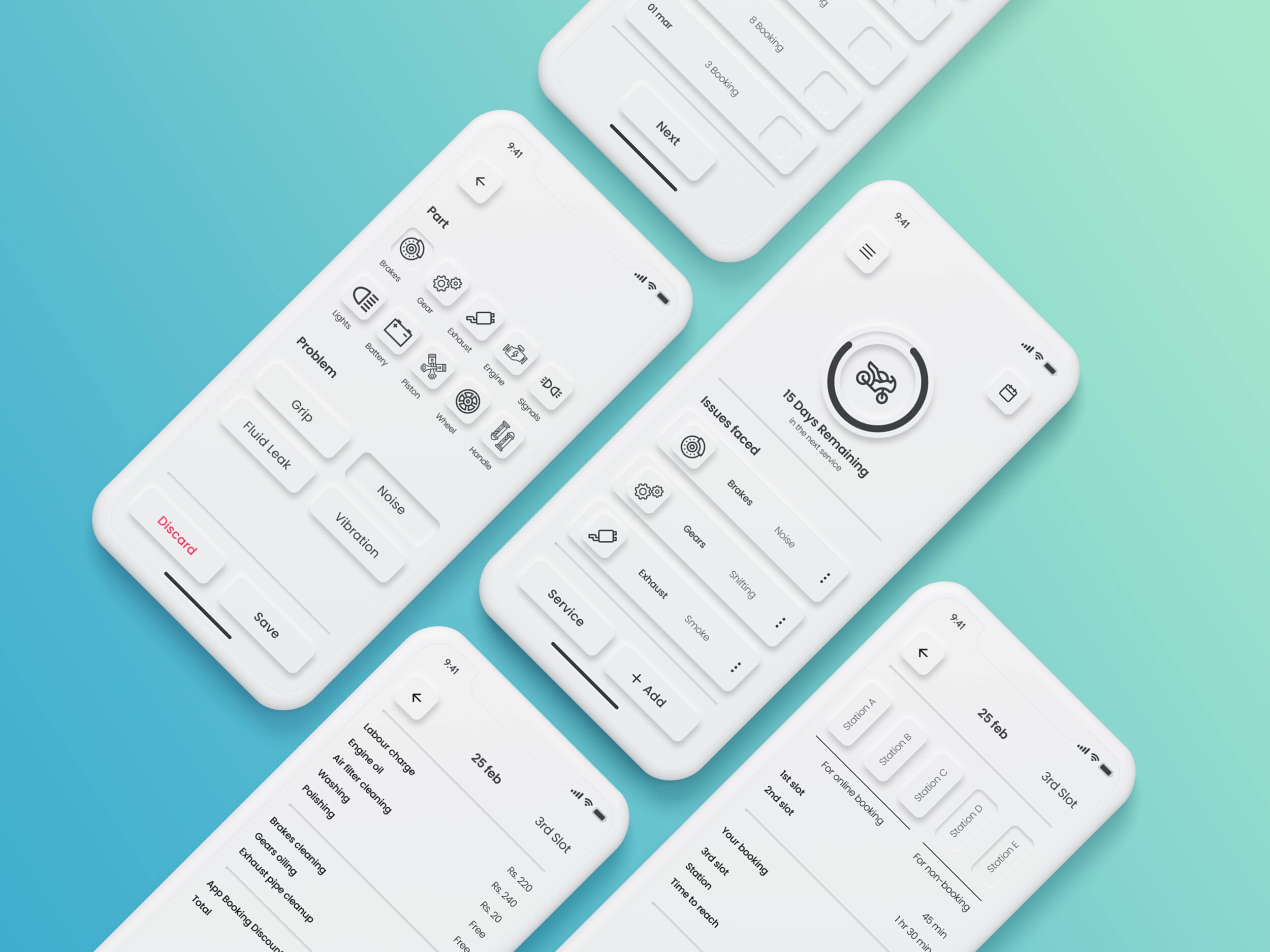
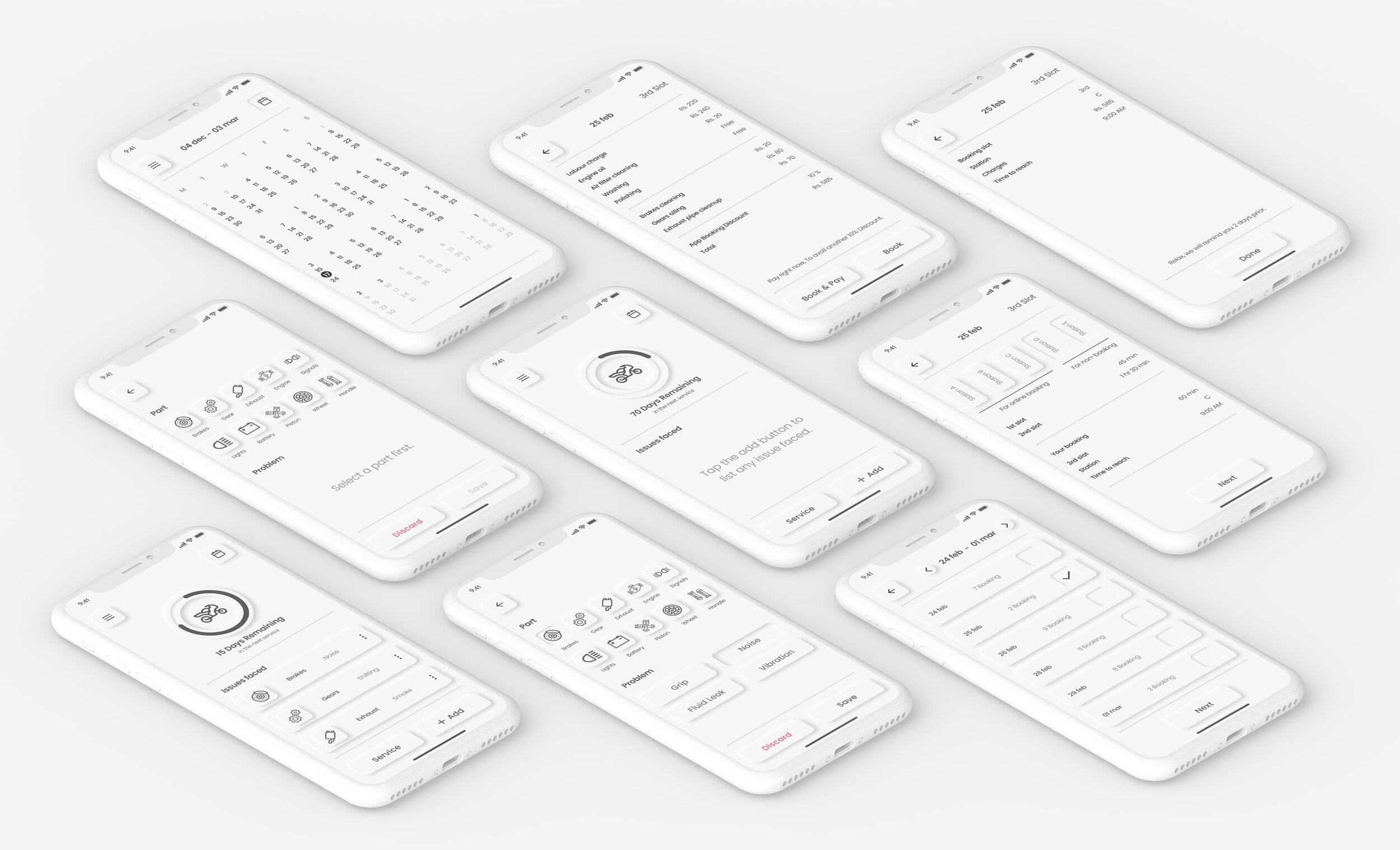
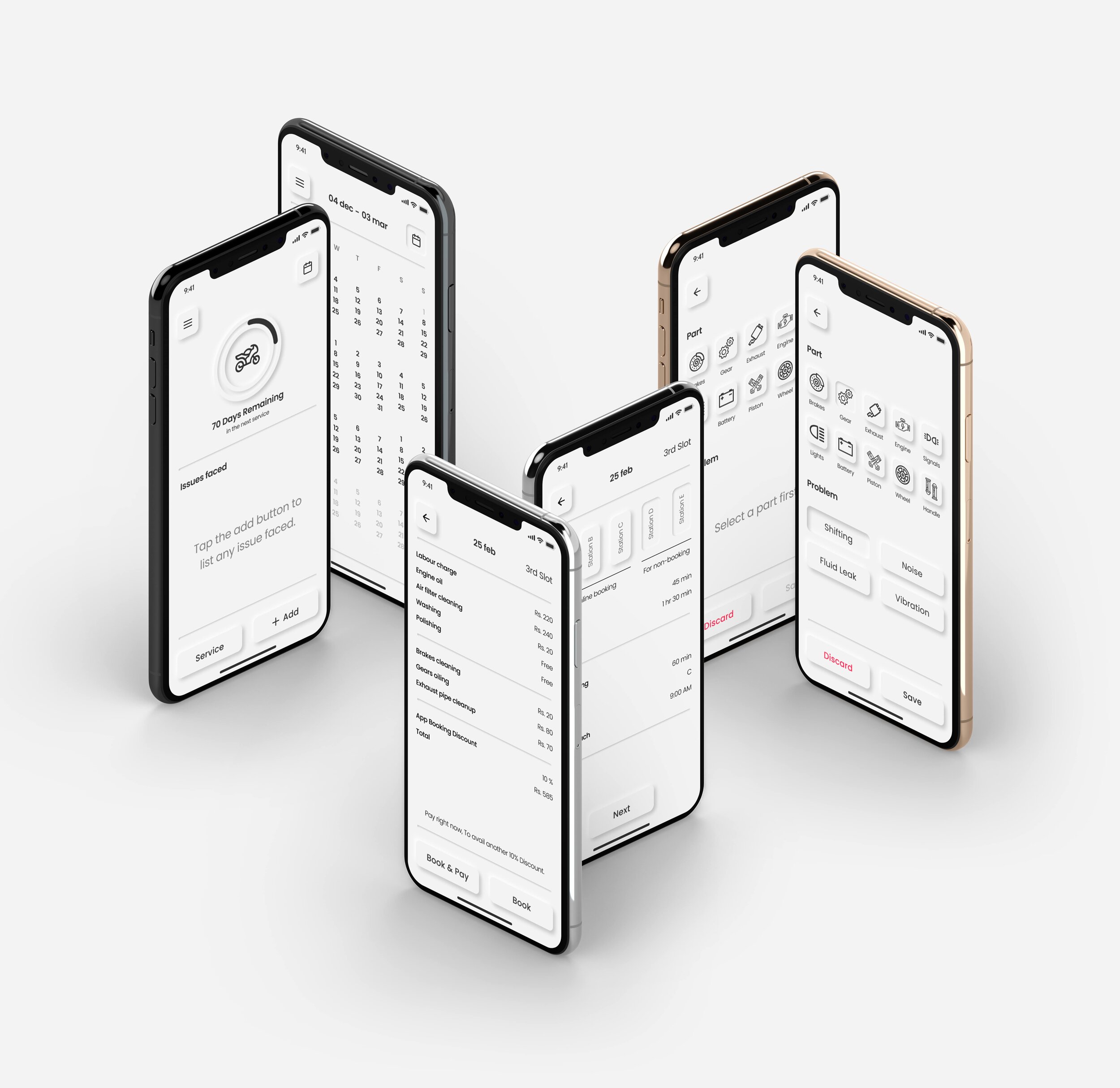
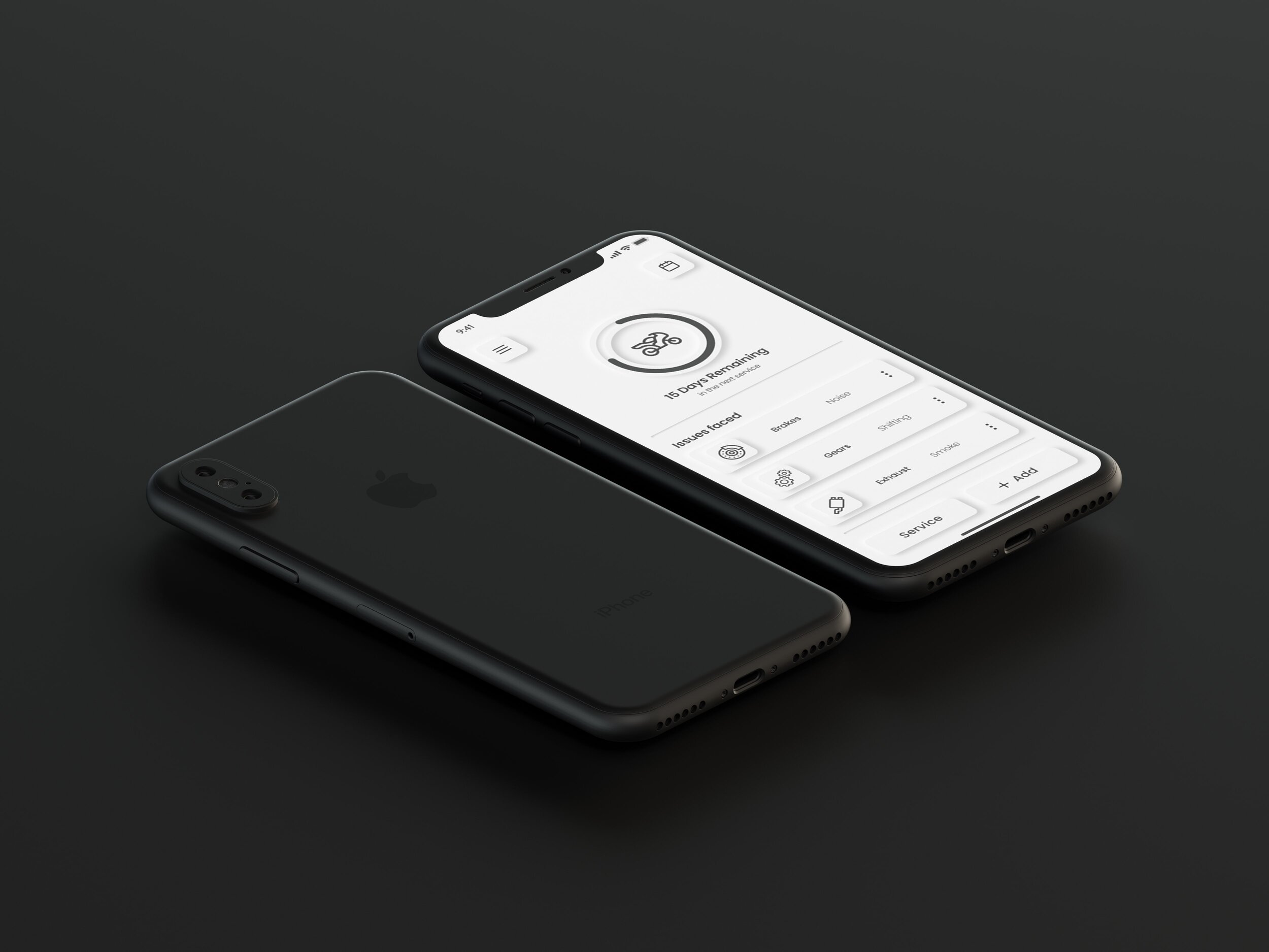
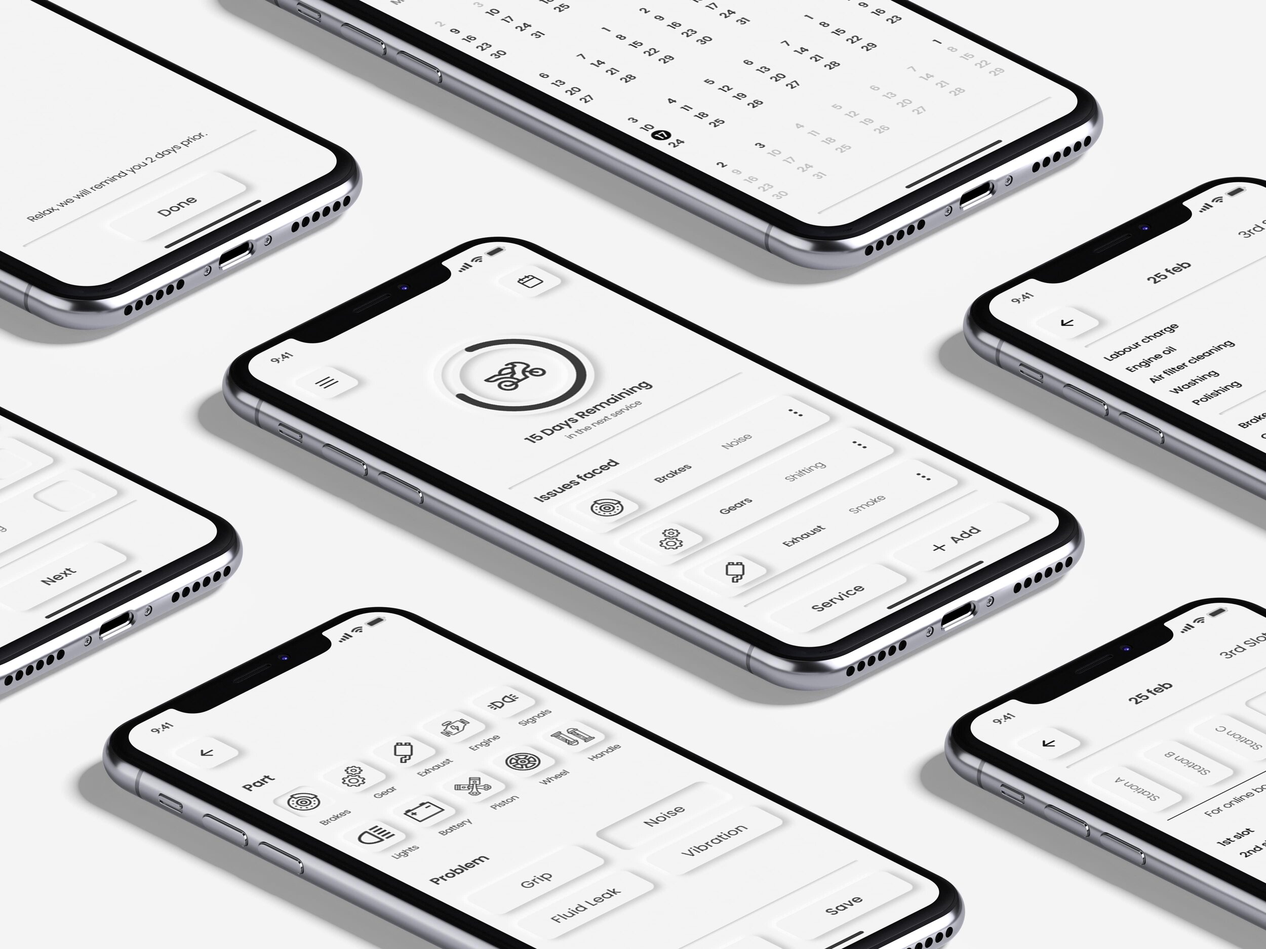
The fourth day of the design sprint was devoted to the creation of the prototype. I had to create visual design and an interactive prototype that involves the full path of the product and user interaction (based on design sprint map).
Here I wanted to try the latest design trend skeuomorphism. In other words, I wanted to learn so I decided to try it myself. As my design has a lot of white space so I think I’ll have no problem including that in my design without affecting any functionality.
DAY 5
FRIDAY
Test
There’s nothing better than getting real user feedback on the products, designs or ideas that you’re working on. Through genuine and honest conversations, user testing can be one of the most valuable things to do before you even commit to investing more time and effort. I’ll begin the interviews using the The Five-Act Interview method.
The Five-Act Interview
Friendly Welcome
Contextual Questions
Introduction to the Prototype
Tasks
Quick Debrief
Friendly Welcome
Here I’ll put the customer at ease and describe a little bit how the Interview will work.
Hello, I'm Lalit and thank you for your time!. So, as a designer, it's our job to always improve our product, and getting your honest feedback.
I’ll ask a lot of questions, but I’m not testing you—I’m actually testing these designs.
If you get stuck or confused, it’s not your fault. In fact, it helps me find problems I need to fix.
And again although its called user testing but you are not being tested, you are helping me test the designs..
Contextual Questions
I'll make sure that we both get to know each other very quickly. It helps in keeping a natural conversation.
How are you today?
What do you do for a living?
Do you own a motorcycle?
How do you get your bike serviced?
Did you have any difficulty with your current process?
Introduction to the Prototype
Revealing the prototype to the interviewee and making sure to put him in a comfortable situation.
Would you be willing to look at some prototypes?
These prototypes are in progress and not fully functional. So, Some things may not work quite right yet.
There are no right or wrong answers. you won’t hurt my feelings or flatter me. In fact, open and honest feedback is the most helpful.
Tasks
Here I'll give the interviewee certain tasks to achieve certain goals so that I can test my prototype.
“To begin, we will assume that you have already downloaded the app. You just notice that your brake is making some squeaking noises while pressing. Now you want to list that issue in the app so that you don't forget to get it resolved in the next scheduled service.”
“In the second scenario, we will assume that you get reminded that there are only 10 days left in your next scheduled service. So you want to book a slot with the minimum number of bookings to avoid spending a lot of time in the workshop.”
Quick Debrief
It is for me to recap what just happened and summarize it. Also, get the interviewee to help me summarize what they felt so far.
What did you like about this product?
What did you dislike?
How would you describe this product to a friend?
Results
All participants completed the task.
All participants stated that it’s easy to use.
All participants stated that they like the concept and the problem this app is trying to solve.
Many participants responded that skeuomorphism design trend looks cool.
UI Shots

Future Steps
Due to my 5 days timeline, I cannot design every single feature to satisfy my user needs. And I think that's okay. Because the sole purpose of a design sprint is to build a product with just enough features to satisfy early adopters in the market, achieve product-market fit and provide feedback for future product development.
So here are some features that I discovered after user testing that will help our users and our product.
Allowing users to add comments to the issue they have listed.
Allowing users to add an image with the issue they have listed.
Providing quick fixes to the related issues.
Adding more choices of service stations in the app.
Allowing users to add multiple vehicles.
Behind The Scenes
The End
Thank you all for reading through this case study. Hope you all enjoyed it.


