Hike Redesign
How might we create a more engaging and seamless experience when it comes to exploring and staying connected?
OVERVIEW
My role
User Researcher
User Experience Designer
User Interface Designer
Project Information
Individual Design Exercise
Tools
Pen and Paper
Figma
Photoshop
Project Constraints
For this project, I'll only look into the hike mobile experience.
My Process
User Interviews
Affinity Diagramming
Empathy Mapping
Persona
Jobs To Be Done
Sketching
Wireframing
Visual Design
Timeline
1 Week
Challenge
Select an Indian application and redesign it to provide a simple and useful user experience.
I choose hike. It is the fastest-growing Indian app to become a unicorn (with a valuation of more than $1B). It had quite a lot of near-death experiences - but has managed to grow rapidly, almost beyond expectations every time and stay afloat in a very challenging space.
Understanding Hike as a company
Hike is a cross-platform instant messaging, Voice over IP, social media and peer-to-peer file sharing application which was launched on 12 December 2012. It allows users to share text and voice messages in real-time when connected to the internet as well as by SMS when offline.
Hike attained a valuation of $1 billion in 3.7 years flat after being founded. This is marginally faster than other Indian unicorns, Inmobi and Ola, which took 4 years each. India’s highest valued startup, Flipkart, took 5 years.
Why redesign now ?
Falling Active User Base
During 2018, Hike’s daily active users (DAU) metric has fallen by a whopping two-thirds—from 23 Mn to 8 Mn.
In addition to the sharp fall of DAUs, monthly active users (MAUs) have declined by more than half—from 37 Mn to 18 Mn.
The current ratio of DAU to MAU (8 Mn out of 18 Mn) is 44%, a marked decline from the 62% (23 Mn out of 37 Mn) it was at eighteen months back. Even among the users who are still on the platform, usage is falling.
Laying off its workforce
2018 has been a tough year for the company.
In May, the company laid off 25 per cent of its workforce, mostly employees coming from its two acquisitions -- hardware maker Creo and social networking venture InstaLively.
It also shut down its operations in Bengaluru.
Losing money
For the same period, the messaging app reported its revenue to be at Rs 26.5 crore, a decline of 33 percent from Rs 39.5 crore in the FY18, even as the company trimmed its expenses by almost half.
In 2019, hike reports loss of Rs 205.6 Cr.
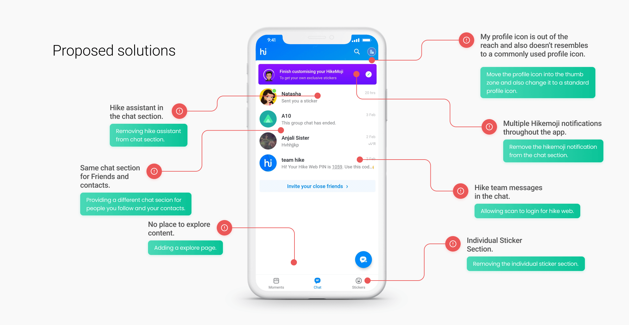
Where can I go wrong ?
Hike tried to create a super app that provided all possible services, including shopping on online marketplaces, booking cabs, ordering food online, online payments etc -- all hinged on an in-app wallet. But turns out it makes the user interface confusing and lead the users to start using other social media and online messaging platforms.
I don't want to introduce too many new features. As hike already dumps its one-app-fits-all approach. So, I need to make sure to keep the user interface simple and pleasing to use.
Redesign scope
Look & Feel
Minor improvements
I'll make sure to use the same primary colours as mentioned by hike in its recent style guide. The official fonts for the Hike app are Neutra Display and Fakt Soft Pro. I couldn’t afford to buy them so I substituted them with Source Sans Pro and Calibri.
Functionality
Minor improvements
I'll be introducing a few new features in the app for this redesign. While doing this, I'll make sure to design keeping functionality in mind and keeping the right balance between minimalism and enough features.
Target Audience
Completely different
The company claimed that 90% of Hike users are between the age of 15-24 years at present. But to acquire more users and to make the app work for everyone, I'll need to broaden the product target audience.

RESEARCH
User Research and Data
User Interviews, Affinity Diagramming, Empathy Mapping, Persona, Jobs to be done
User Interviews
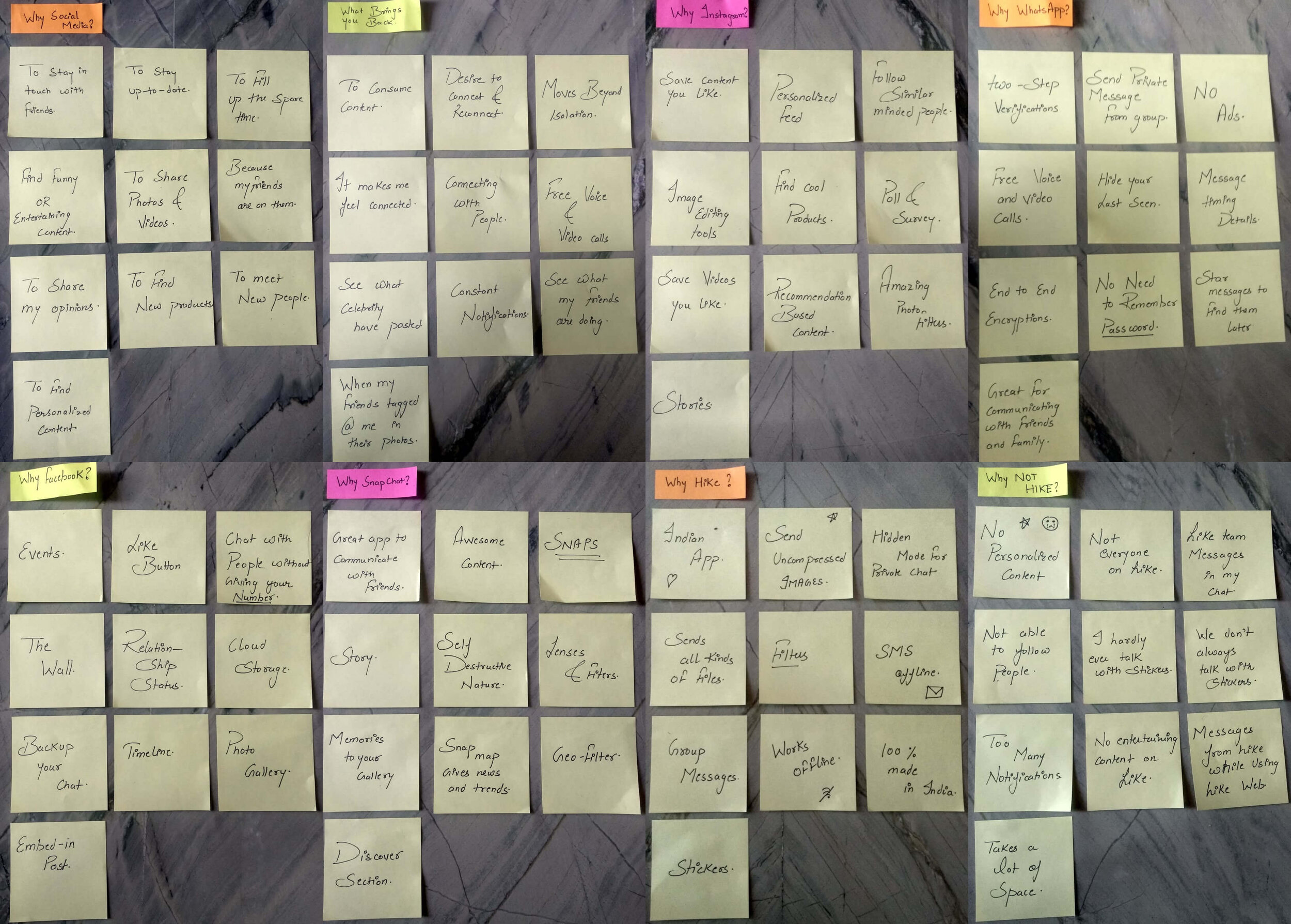
I conduct a quick semi-structured interview with people around me. By performing interviews, I learnt why and how people use social media.
why do you use social media ?
What brings you back to any social media platform after using it once ?
What do you love about hike ?
What do you hate most about hike ?
What makes you choose other social media platforms over hike ?
what do you like about other social media platforms ?
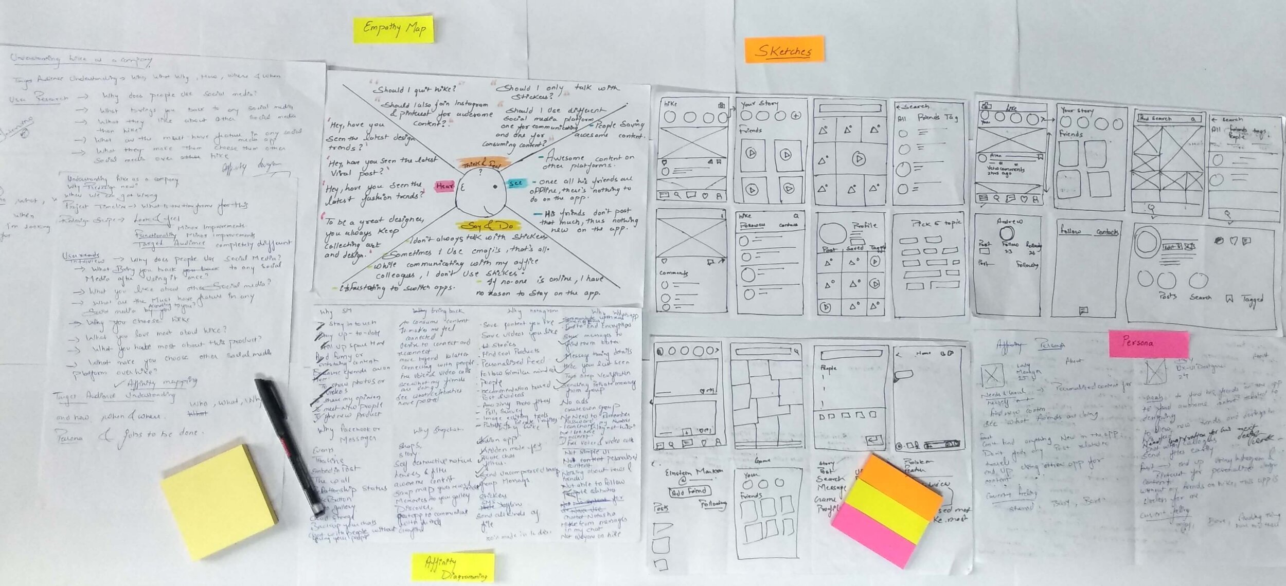
Affinity Diagramming
I did affinity diagramming to organize my research findings into categories that would help me digest all these pieces of information efficiently.

Empathy Mapping
Visualizing user attitudes and behaviours in an empathy map helps us align on a deep understanding of end-users. The mapping process also reveals any holes in the existing design.

Personas
After Analyzing the data collected from research , I created two personas that represent my target users for the app.


Jobs to be done
This will help us understand the user’s motivations and expectations.


DESIGN
Ideation & Design
Competitor analysis, Addressing pain points, Improvement opportunities, Priority matrix, Sketches, Wireframes, Visual design
Competitor Analysis
A competitive analysis is a great way to learn about standard practices, leading approaches, approaches to avoid for an app in this domain.


The more I looked into other social media platforms and researched other apps in my domain, the more I realized that using followers term instead of friends is the right way to go.
Addressing Pain Points
After identifying pain points directly from user quotes, I come up with common ones that users were having trouble with.

Improvement Opportunities
After identifying standard practices & leading approaches around social media platforms, I Brainstorm possible solutions.
Priority Matrix
Prioritization charts or matrices can help us base important decisions on objective, relevant criteria instead of subjective opinions.

Sketches
The main idea of sketching is to come up with the best solution to a problem. Sketching allows us to try out a multitude of ideas and iterate them before settling on one.
But before I start sketching, I need to keep in mind these design goals -
Need a screen where users can select the topics they like.
Need a screen where users can see the content based on the topics they choose.
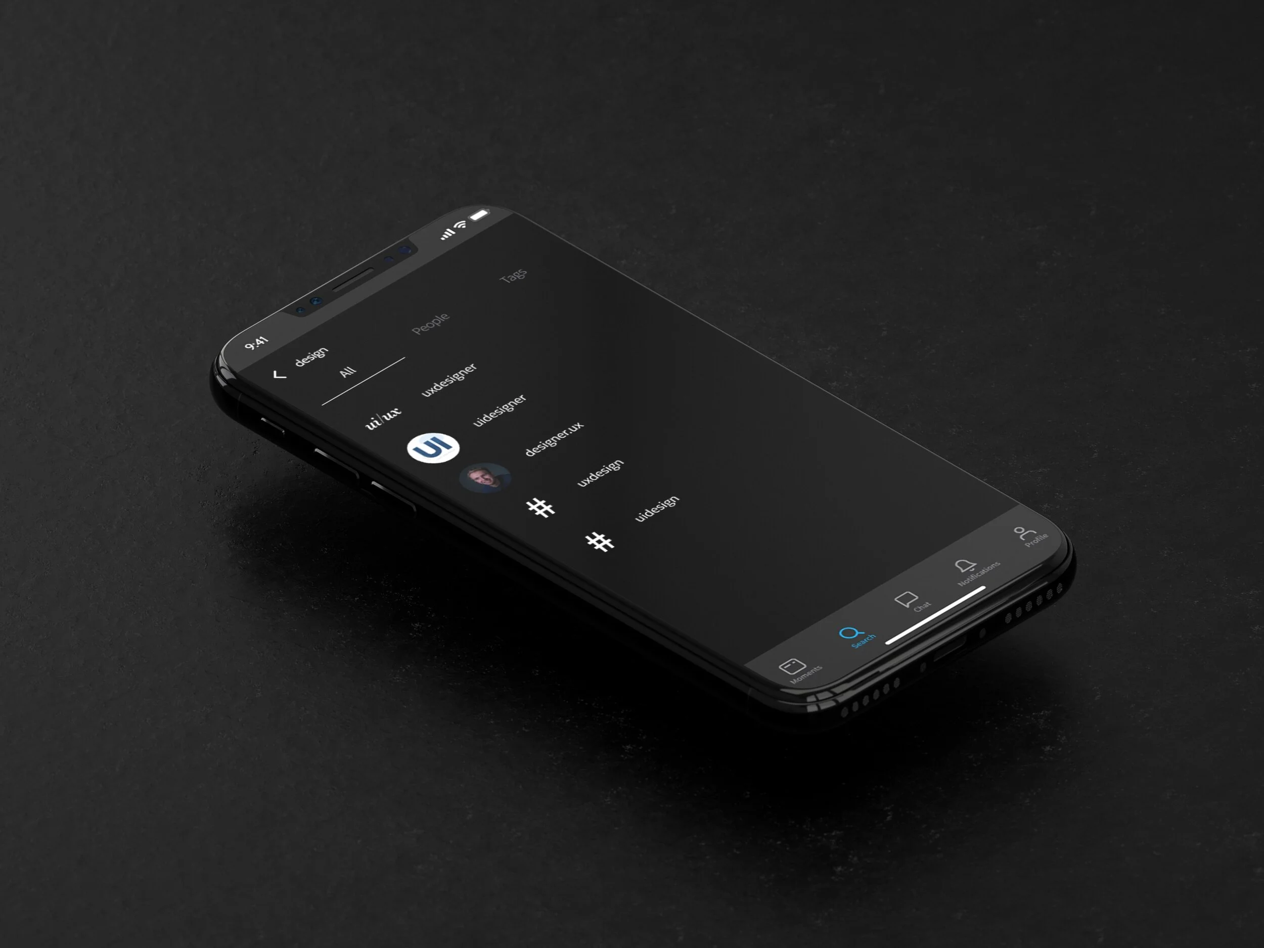
Need a way that allows users to search for content by hashtags.
Need a way that allows users to keep their messages from contacts and followers in different sections.
Need a way that allows users to save the content they like.
Need a way to allow users to access the content they had saved.
My goal is to generate as many ideas as possible and choose the most promising ones.

Wireframes
Wireframing is used to define the hierarchy of items on a screen and communicate what the items on that page should be based on user needs.

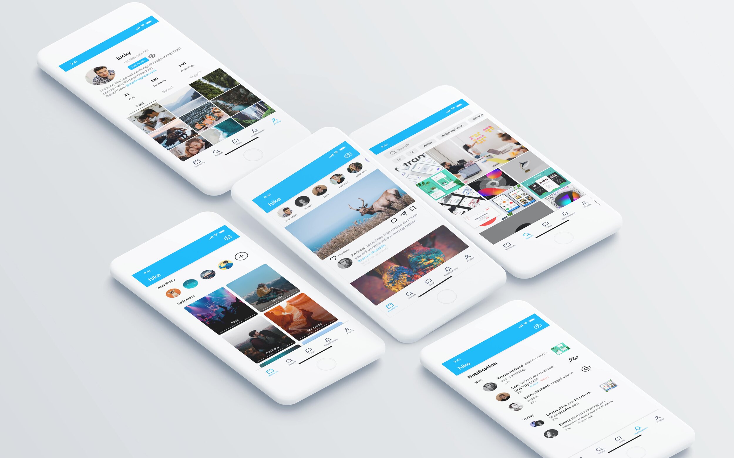
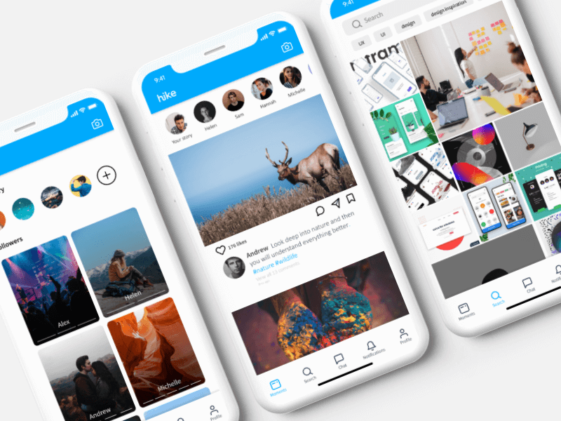
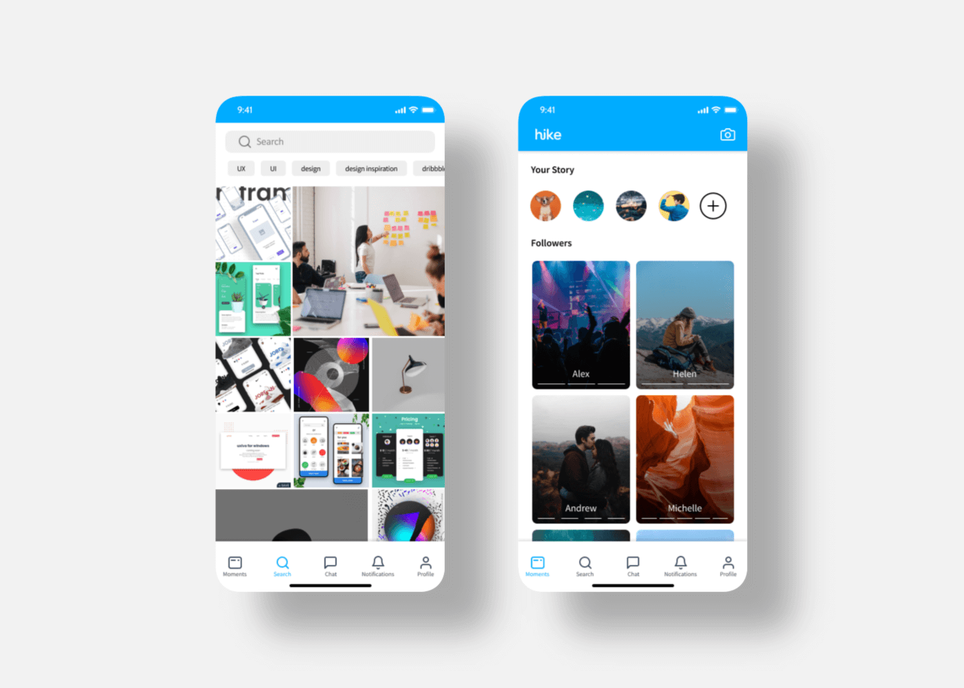
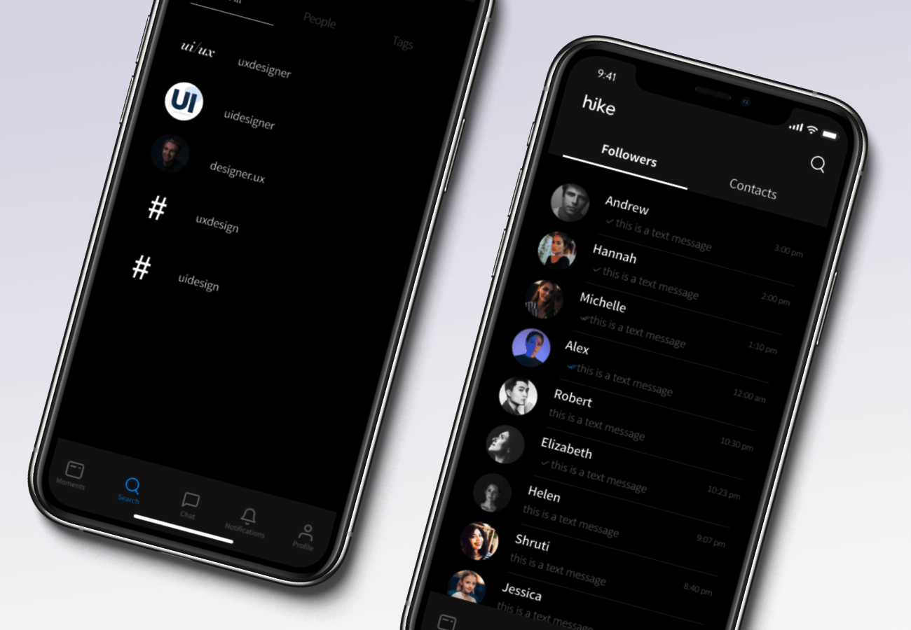
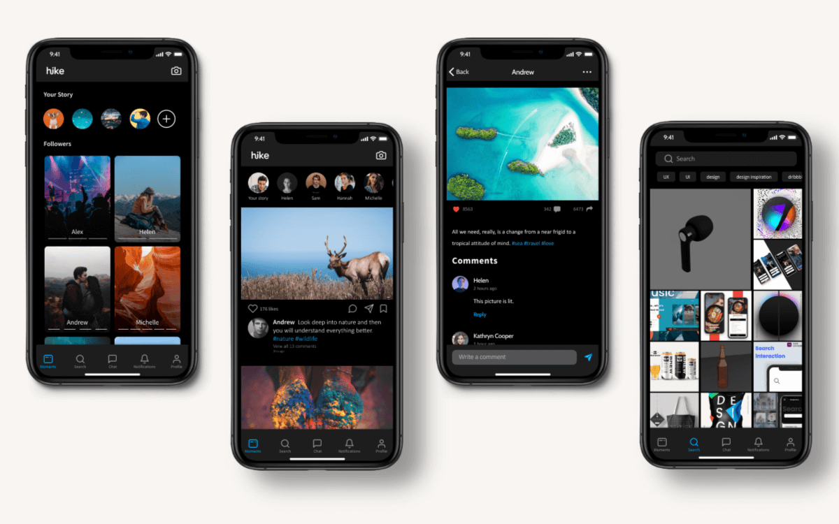
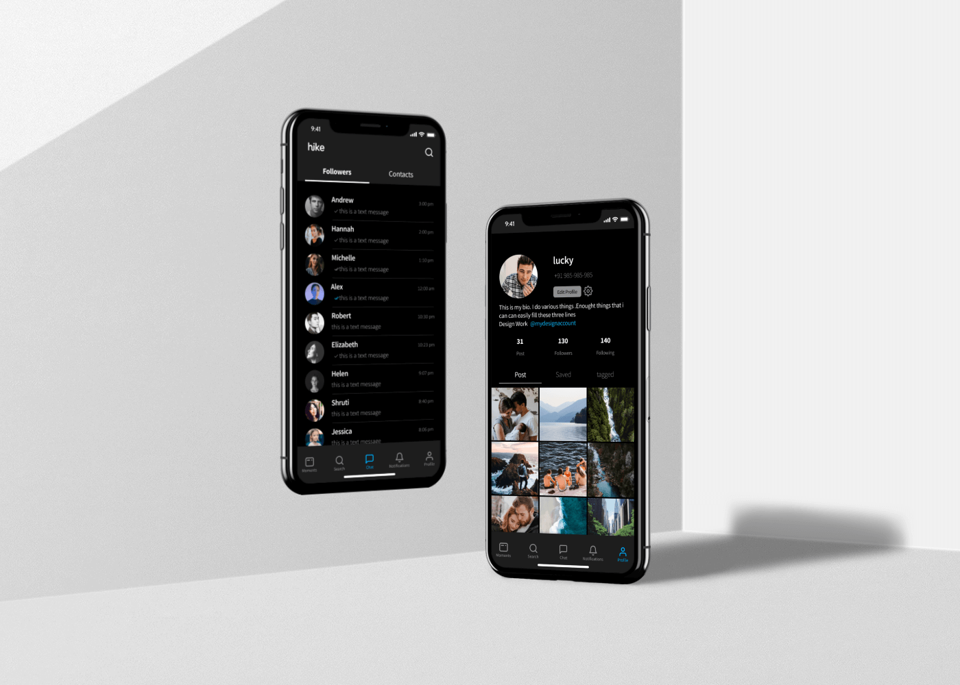
UI Design


Slide To See Detailed UI View


UI Shots

Measuring success
Coming up with a solution doesn’t help much if we don't know how to measure its success. Now is the time to close the loop and define how we can validate the solution. To do that we need to ask ourselves a question. How would we know that the solution was successful?
Daily Active Users (DAU)
Monthly Active Users (MAU)
Daily Sessions Per DAU
Stickiness (DAU/MAU)
Likes/Comments/Shares Clicks
“Save” Button Clicks
Future steps
There are a lot of things that I thought about but didn’t have more time to develop as:
Allowing users to use hike web by scanning QR code.
Allowing users to use hike assistant while they are communicating with their friends.
Introducing In-app games that will allow users to live battle their friends.
Integrating stickers within the In-chat keyboard.
Allow users to send money to their friends through the app.
Assumptions
People are willing to give hike a try.
people are happy to explore other social media platforms.
Hike team members are willing to put awesome content on the app themselves in the beginning. This will encourage users to also put their content on the app. (Wizards of Oz).
Behind the scenes
The End
Thank you all for reading through this case study. Hope you all enjoyed it.