Atom
User Experience and User Interface Design Intern
OVERVIEW
My role
User Experience Designer
User Interface Designer
About Company & Location
Health & Fitness App
Gurgaon, Haryana, India
Intern Period
2 Months
Tools
Pen and Paper
Google Doc & Sheet
Whimsical
Figma
Photoshop
Understanding Atom as a company
Self-regulation is the biggest problem in modern times. Technology should support us instead of distracting us away from our true path.
At Atom, they are attempting to solve exactly this by using principles of behaviour psychology, game design and AI to help people achieve their goals.
Since they cannot target multiple habits in one go, they are starting with meditation and cell phone usage regulation as their first use case to solve for
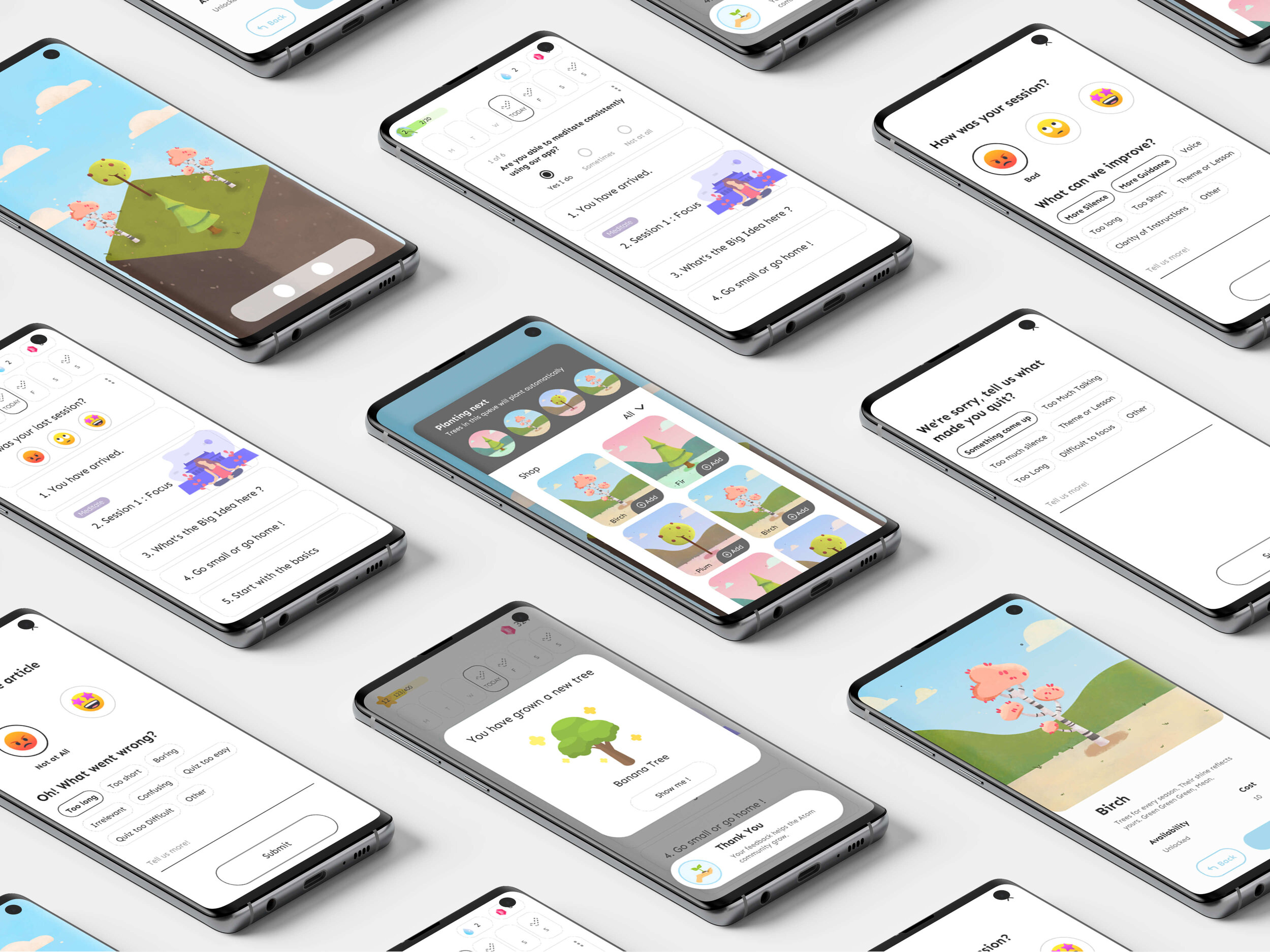
In App Feedback
What is In-app Feedback ?
By ‘In-app Feedback’ we can collect feedback from the beta users about the current User Experience of the App.
The Feedback will tell us about what they like, what they don’t like, what can we improve, suggest a feature.
The feedback will be collecting on various phases like finishing a task, abandoning a task or Skipping a task.
Team
Co-Founder - Samvid Sharma
Product Manger - Vipul Jain
UX/UI Designer - Lalit Arya
Objectives
To get paid beta-users for detailed feedback over time
To collect open-ended feedback about the user’s experience of the app
Rate your experience
What can we improve?
What do you like?
What do you not like?
Suggest a feature
etc.
To collect specific feedback on an action or set of actions, directly after the action(s):
Finishing a meditation
Skipping daily meditation feedback
Quitting a meditation without completion
Completing an article with a quiz
Quitting an article without completion
Goals
The feedback helps improve Atom app experience (assessing the effectiveness of anchor habits, games, meditation sessions, articles)
The feedbacks helps in assessing the value prop of the Atom (habit consistency)
The feedback helps in understanding the loyalty of the user (NPS score and willingness for engagement)
The feedback helps in assessing change in the above parameters via periodic follow-ups
Guidelines for taking feedback
Keep surveys short and sweet
Except in a few very specific cases (which usually involve a more formal invitation) brevity is your friend. Don’t try to ask all your questions at once.
Pay attention to design details
Looks matter—the user experience matters even more. Users often perceive aesthetically pleasing design as design that’s more usable.
Minimise the number of mandatory fields
Something is better than nothing. Don’t get greedy and demand all or nothing.
Avoid asking for information you already have
Asking people for data you already have on file is a complete waste of their time. Don’t waste their time. Full stop.
When to ask for feedback
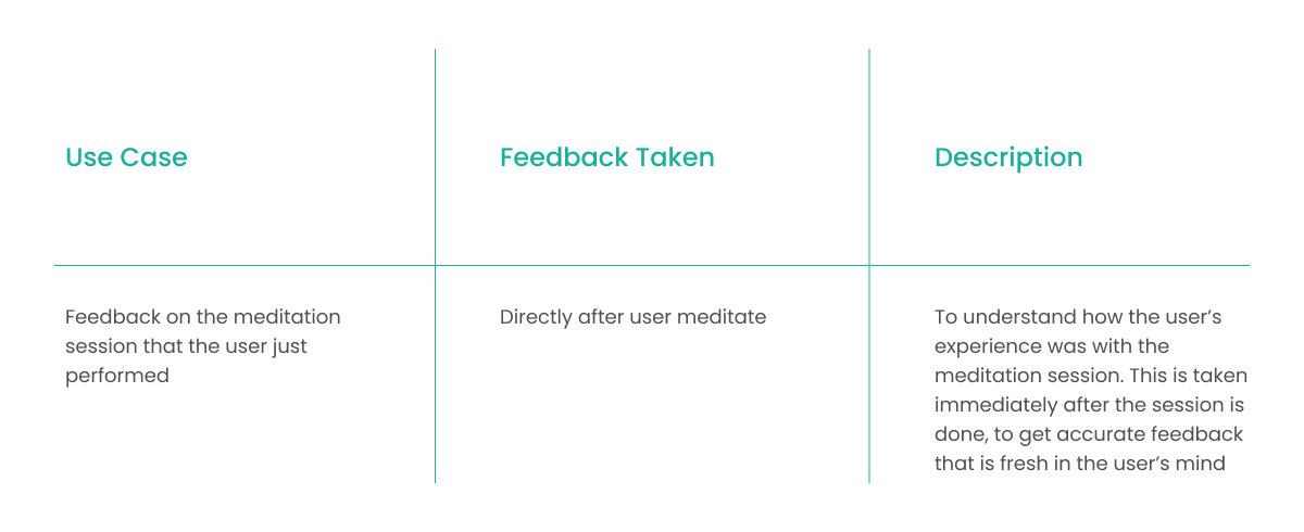
When the user finishes the meditation session- every day or once in two days.
When the user quits any session abruptly - once.
When the user gets familiar with the app and its various services.
Hypothesis
The user should be able to provide feedback at the termination of every session because that increases the probability of genuineness of feedback.
Users should have the option to provide it sometime after the last session so that they get ample time to reflect on their journey.
The reflective feedback should be a mix of descriptive and objective questions to personify individual user experience.
The user should be able to address all his problems/pains related to the session (ability, schedule, difficulty) in an easy and concise manner.
The user should feel how his feedback is so valuable to the success of his habit and service because this helps in making the user establish a deeper connection with the product.
Use Case 1/6 : Daily Meditation Session Feedback
Functional Description
Stages
User Journey
Task flow and Wireframes
Prototype
Use Case 2/6 : Last Meditation Session Feedback
Functional Description
Stages
User Journey
Task flow and Wireframes
Prototype
Use Case 3/6 : Quitting Meditation Session Feedback
Functional Description
Stages
User Journey
Task flow and Wireframes
Prototype
Use Case 4/6 : Daily Article Reading Session Feedback
Functional Description
Stages
User Journey
Task flow and Wireframes
Prototype
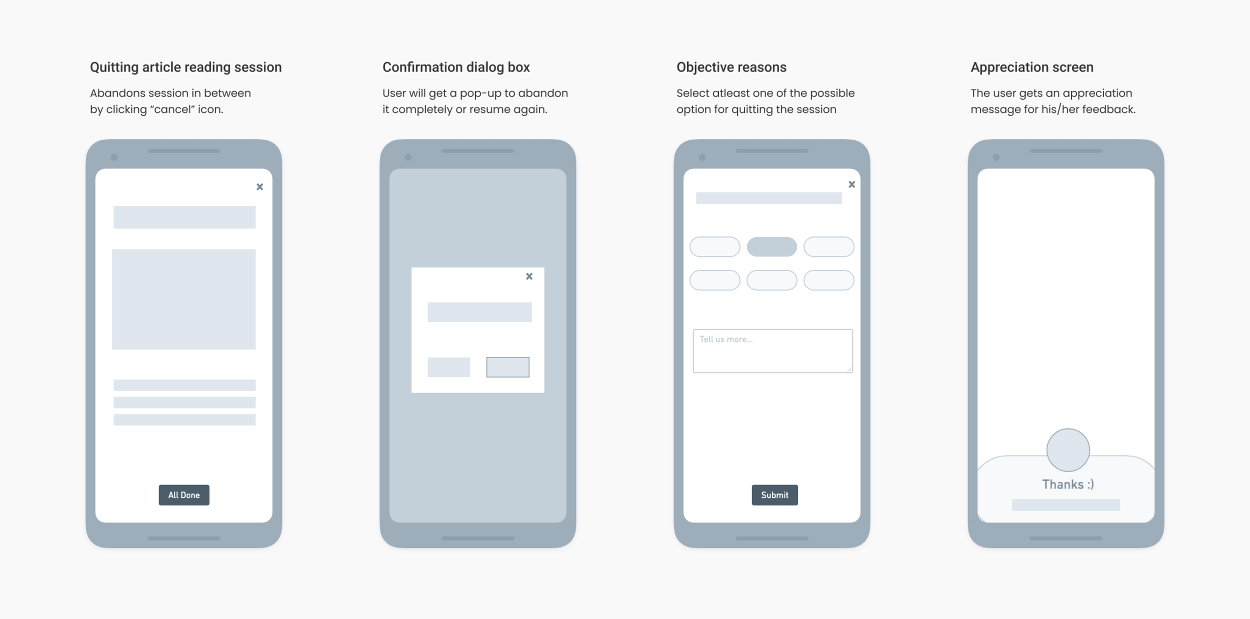
Use Case 5/6 : Quitting Article Reading Session Feedback
Functional Description
Stages
User Journey
Task flow and Wireframes
Prototype
Use Case 6/6 : Overall Experience Feedback
Functional Description
Stages
User Journey
Task flow and Wireframes
Prototype
Metrics of success for In-app feedback
% Feedback Collected :
# of feedbacks received/number of feedbacks requested
% of adopted users who have given at least 1 feedback
Quality of feedback :
Are we collecting information from a relevant audience?
Is the information collected skewed, noisy or biased in any way?
What I have learned
The different design processes that we read on books are for ideal scenarios. They are just logical steps that will help you move across the design process. In real it is kinda messy flow. You move between different steps.
In an ideal scenario, the designer will test every single iteration before shipping it but in reality, that's not always the case.
In an early-stage startup, sometime you will be working on building UI, sometimes writing copy, sometimes finding the right illustrations, sometimes making small UI changes and sometimes on the optimisation of design file for better hands-offs
The End
Thank you all for reading through this case study. Hope you all enjoyed it.


