Atom
User Experience and User Interface Design Intern
OVERVIEW
My role
User Experience Designer
User Interface Designer
About Company & Location
Health & Fitness App
Gurgaon, Haryana, India
Intern Period
2 Months
Tools
Pen and Paper
Google Doc & Sheet
Whimsical
Figma
Photoshop
Understanding Atom as a company
Self-regulation is the biggest problem in modern times. Technology should support us instead of distracting us away from our true path.
At Atom, they are attempting to solve exactly this by using principles of behaviour psychology, game design and AI to help people achieve their goals.
Since they cannot target multiple habits in one go, they are starting with meditation and cell phone usage regulation as their first use case to solve for
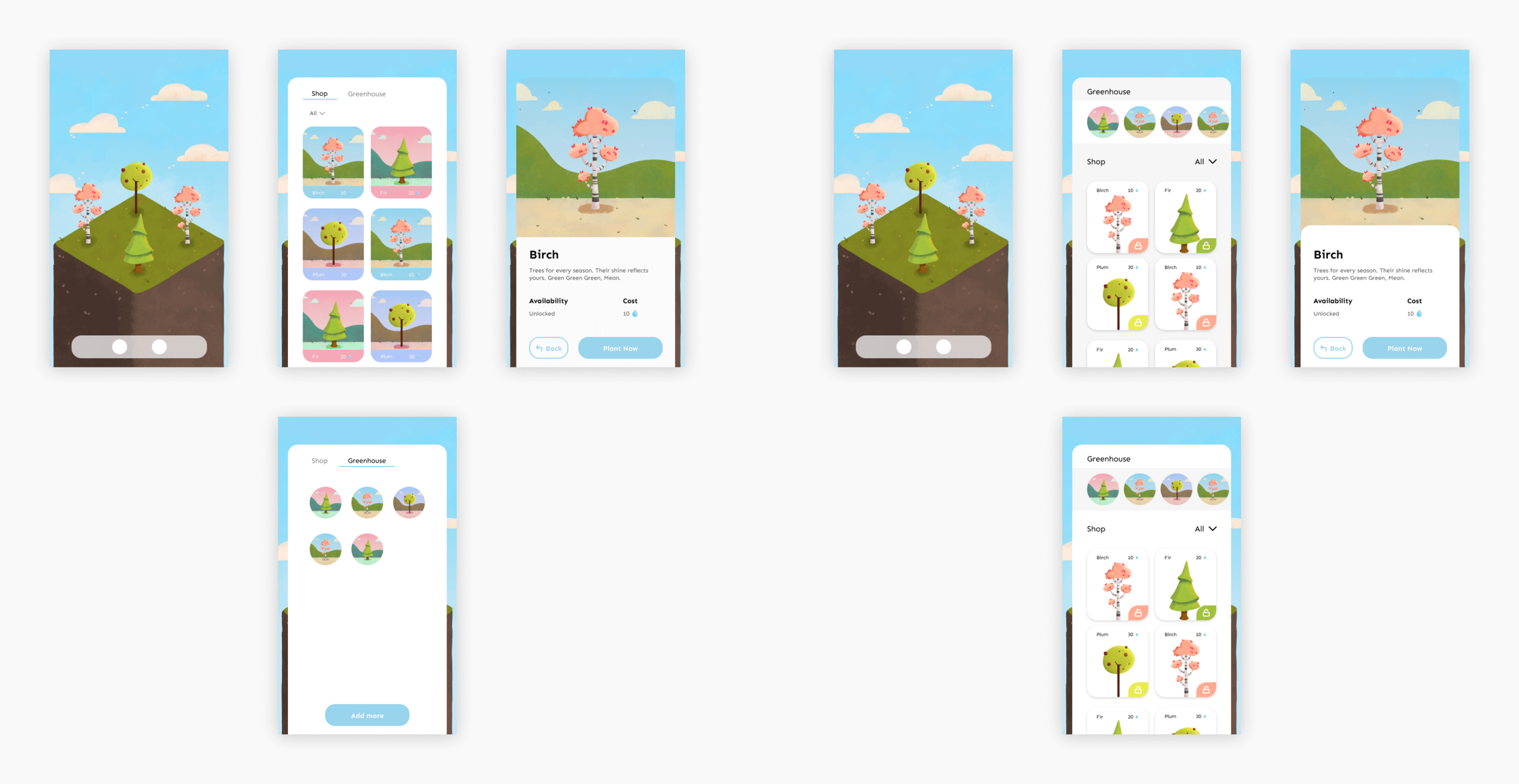
Game Shop Redesign
What is Game Shop ?
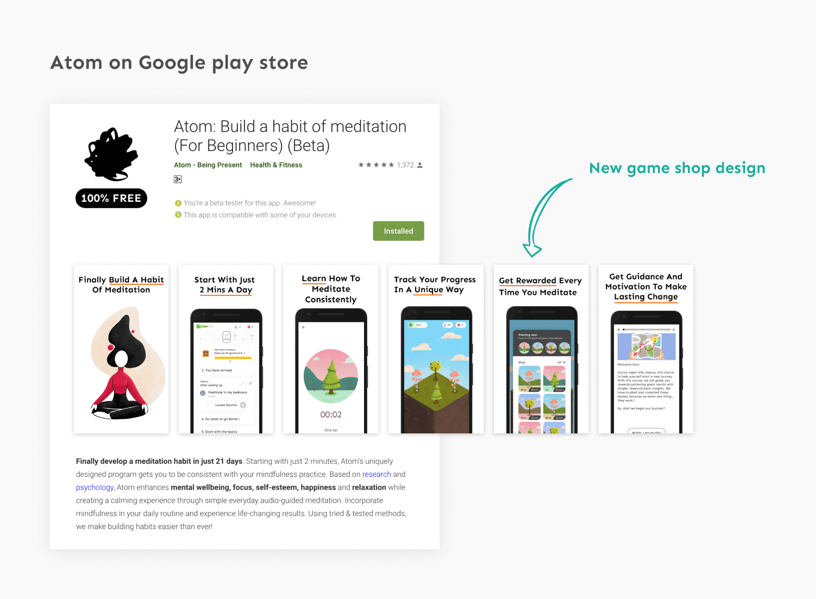
After each successful meditation session, User is rewarded with a tree.
So, The Game Shop provide with various kinds of trees to grow into user virtual forest in the app. It helps the user track his/her progress in a unique way.
What is Planting next queue ?
It allows users to arrange multiple trees in the order of their preference for growing in the forest.
once the user earns enough points through a meditation session, the tree will automatically get planted in the forest.
Team
Co-Founder - Samvid Sharma
Illustrator - Tanya Jaiswal
UX/UI Designer - Lalit Arya
Addressing Pain Points
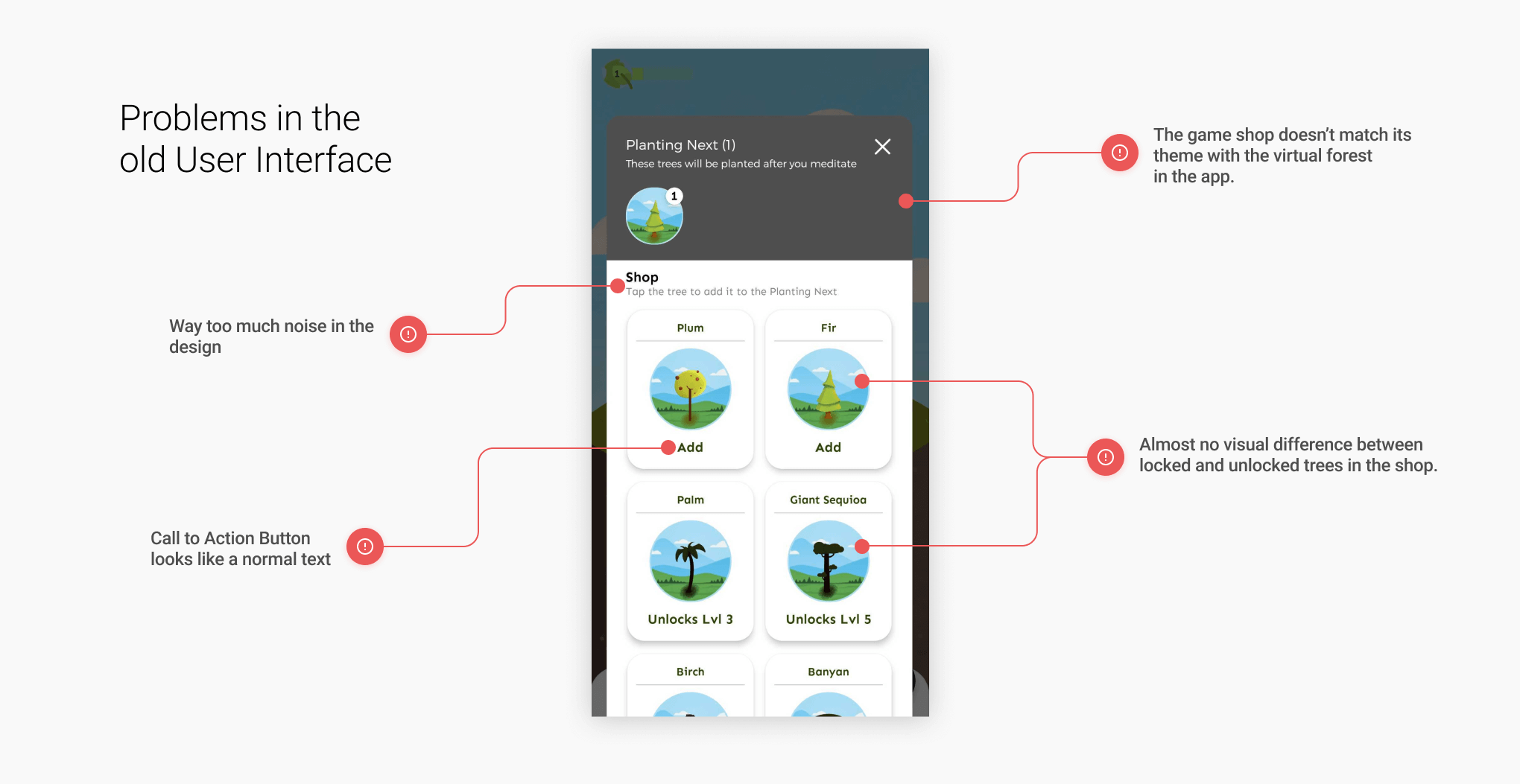
After using and playing with the game shop, I come up with common ones that we were having trouble with.
Improvement Opportunities
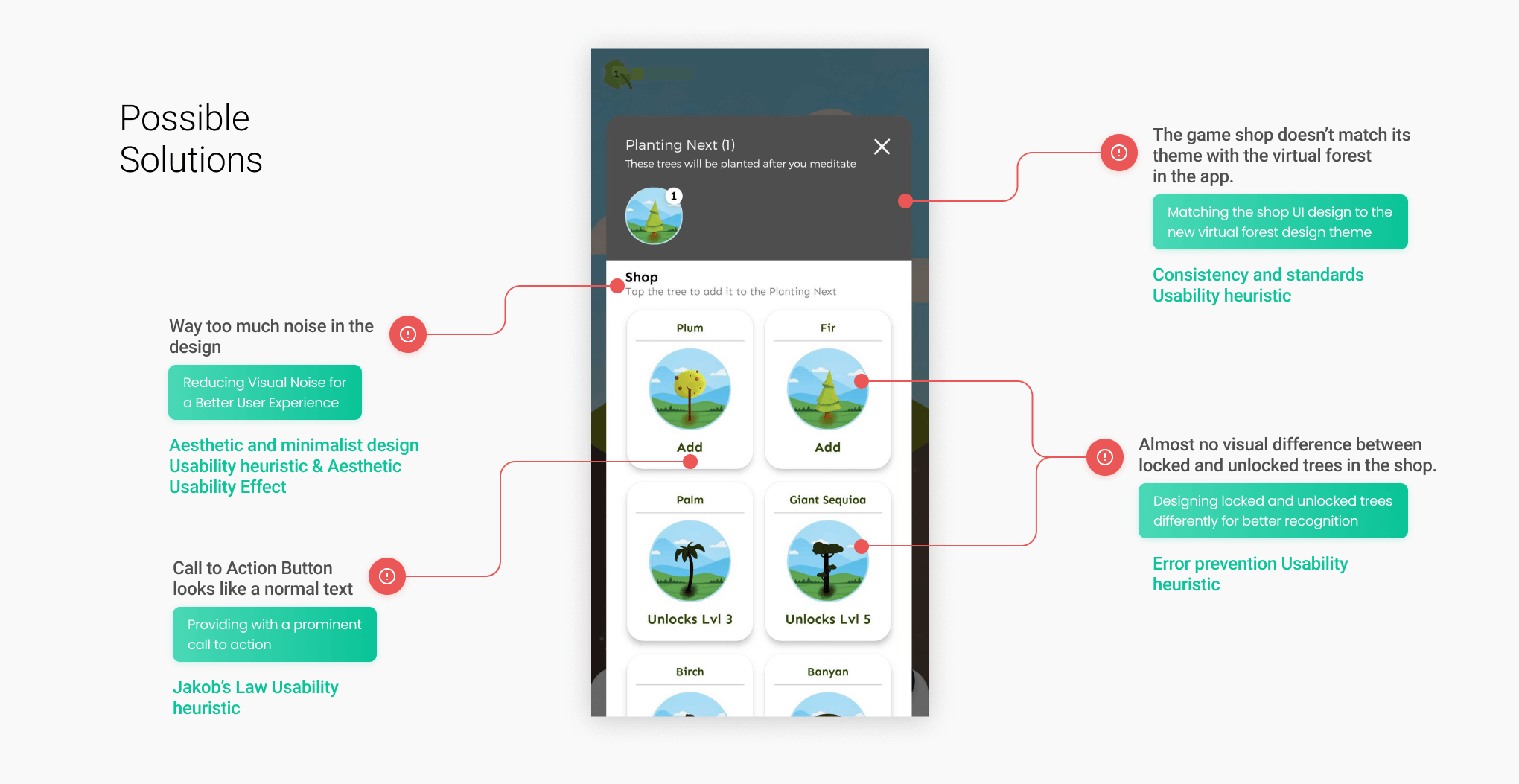
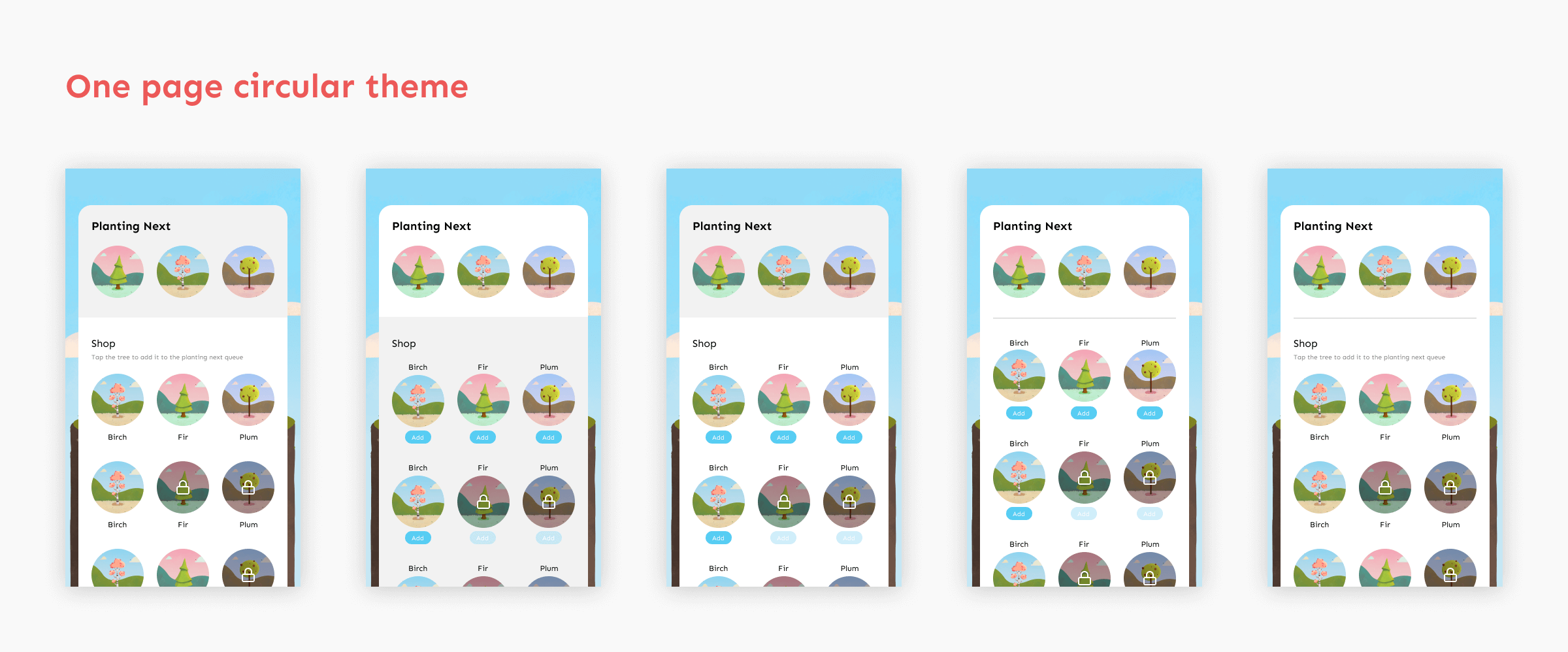
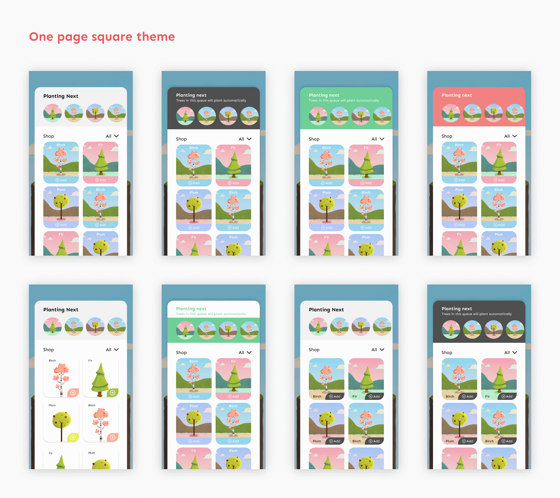
After identifying standard practices & leading approaches, I Brainstorm possible solutions.
Design iterations
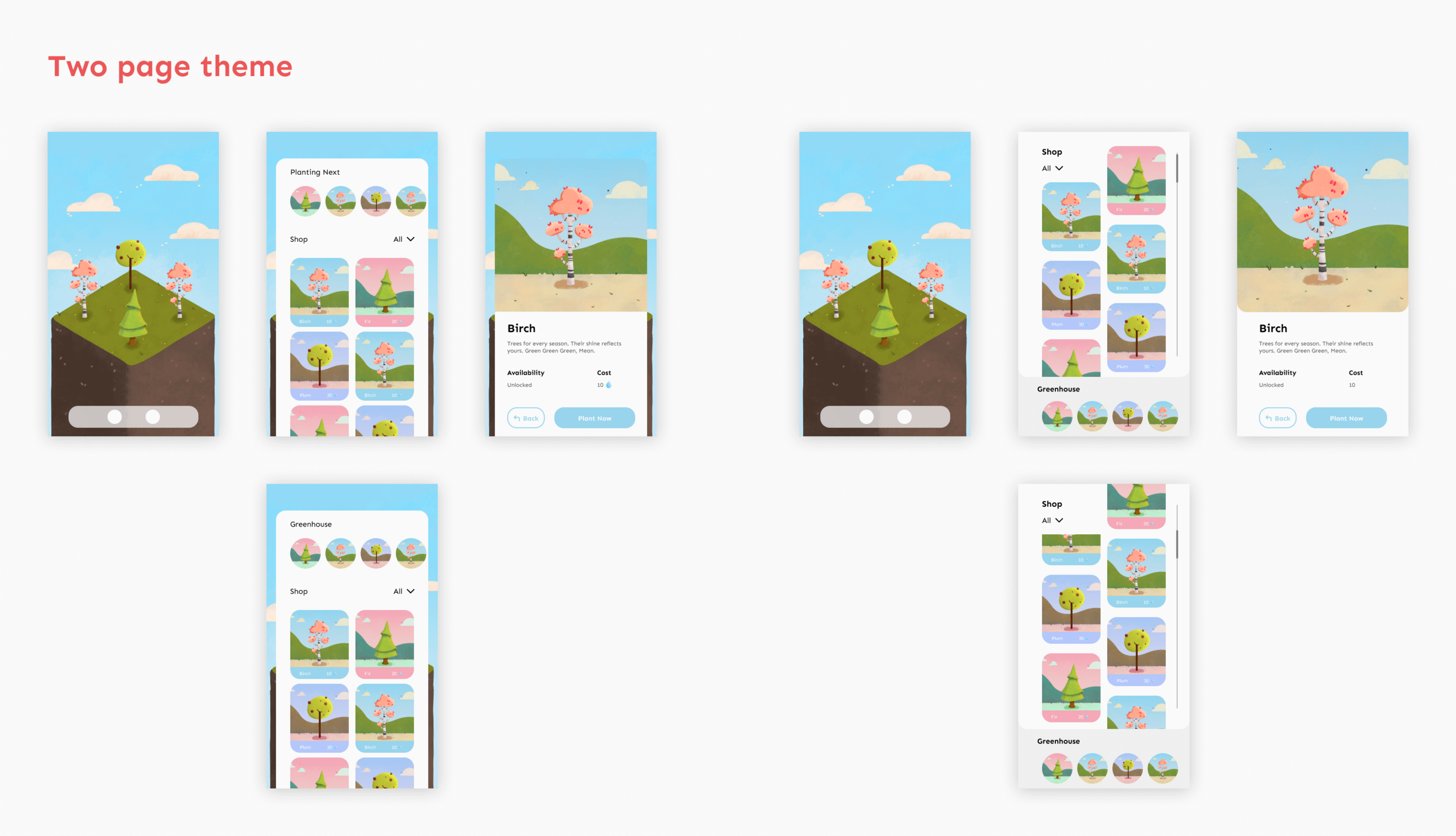
My goal here is to generate as many ideas and variations as possible and choose the most promising one.
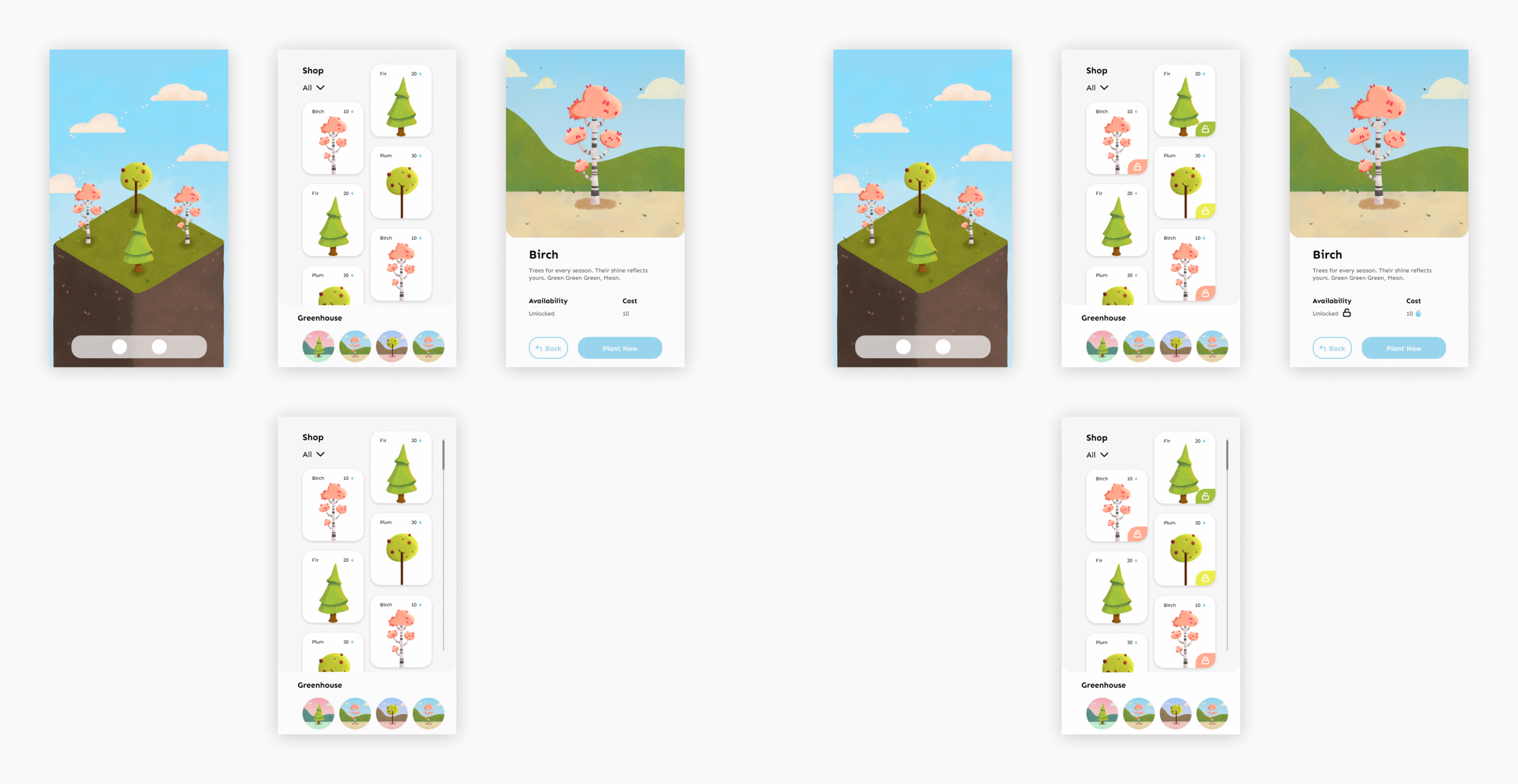
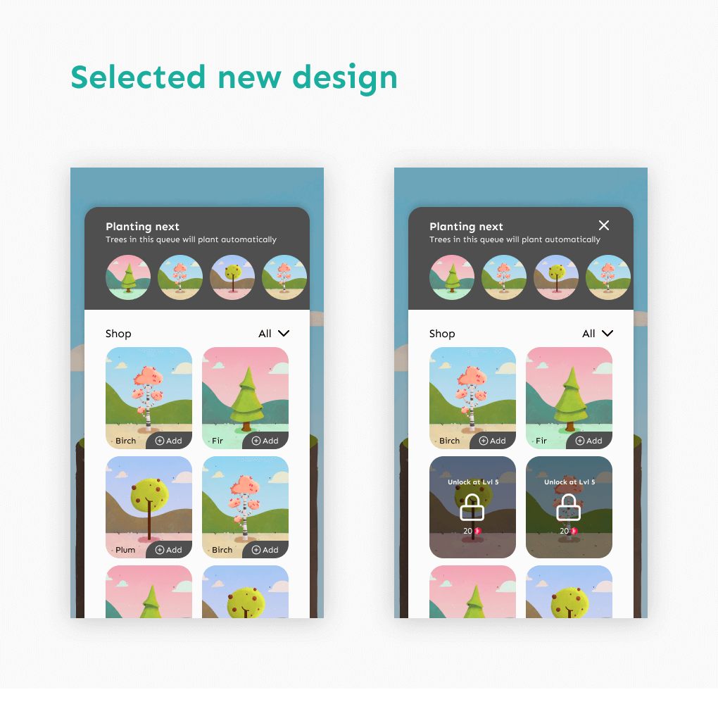
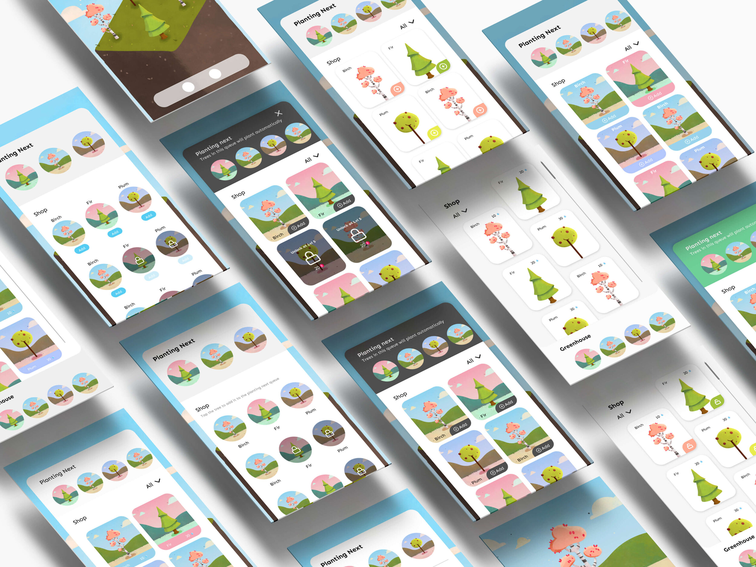
New Game Shop Design
This design solves the previous design problems.
Consistent Design - Match its theme with the new virtual forest in the app.
Less Visual Noise - No lines, No Shadows, eliminating unnecessary components that distract users from the information they really need.
Error Prevention - Locked and unlocked trees are visually distinguishable.
Right Buttons - Prominent and noticeable buttons.
Easy onboarding - As the new design sits over the design pattern or layout of the previous game shop design.
New design in use in the current app
It’s really soothing to see something you designed used into an actual product. Before my internships, everything I designed was either for my skill building or for my self initiated projects on my portfolio
The End
Thank you all for reading through this case study. Hope you all enjoyed it.

